This logo I designed for Forward Theater Company was based on the iconic Madison statue “Forward”.
While I’m very proud of the logo they ultimately went with, I was also rather satisfied with how this alternate ambigram design turned out, even if it didn’t make the cut:

Conceptually I liked the idea of a Forward logo that’s always facing “forward”, and I thought the somewhat “art deco” stained glass aesthetic worked well.
Borbello’s pizza was Orv’s premium pizza brand, but you wouldn’t have known it from the original packaging. We started with a redesign of their logo, and moved on to do a full redesign of their packaging.
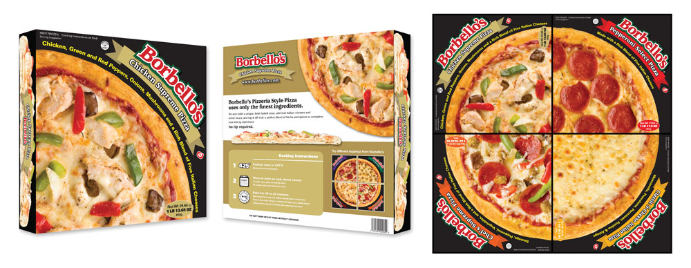
Somewhere along the lines Orv’s was bought by Bernatello’s and the Borbello’s line was discontinued. (It’s too bad—it was a pretty good pizza.)

In addition to this logo design for The Employer Group, I filmed and edited a series of customer testimonial videos for them.
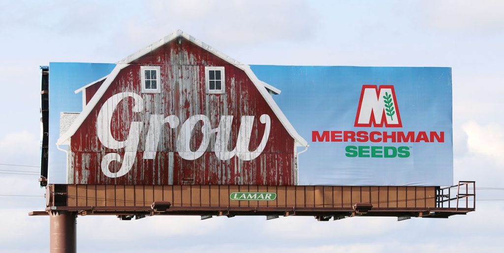
During the time we worked as Merschman Seeds’ agency of record, I did a variety of different projects for them.
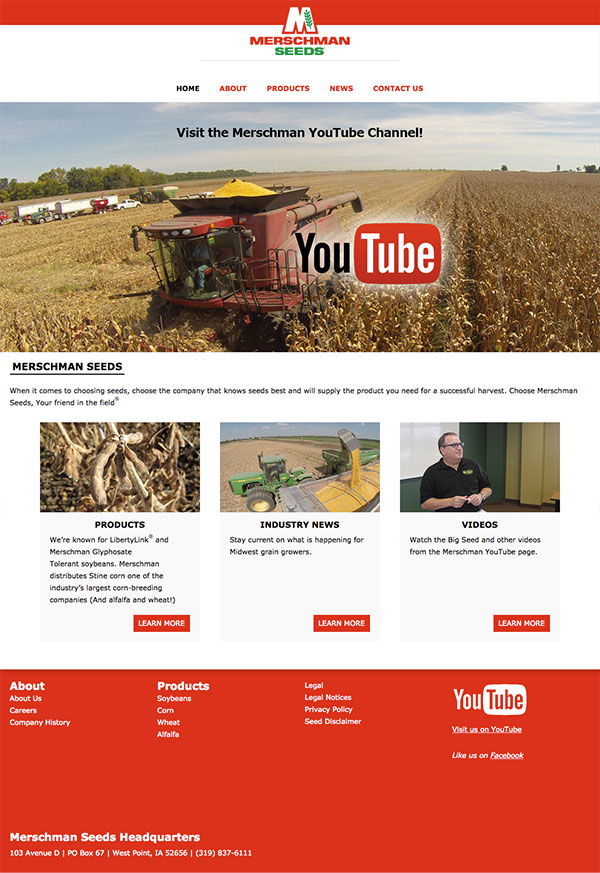
I designed, implemented, and deployed Merschman Seeds’ website, including a customized content management system that allowed them to list all of their seed characteristics right on the site, with consistent formatting.
I also edited the “Merschman Minute” series, with owner Joe Merschman narrating short promotional videos exactly a minute long. Part of the goal for this project was to have quick turnaround times, so Joe would record audio only, and I then edited together the visuals using photos and text.
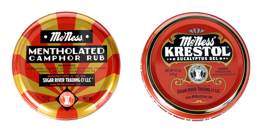
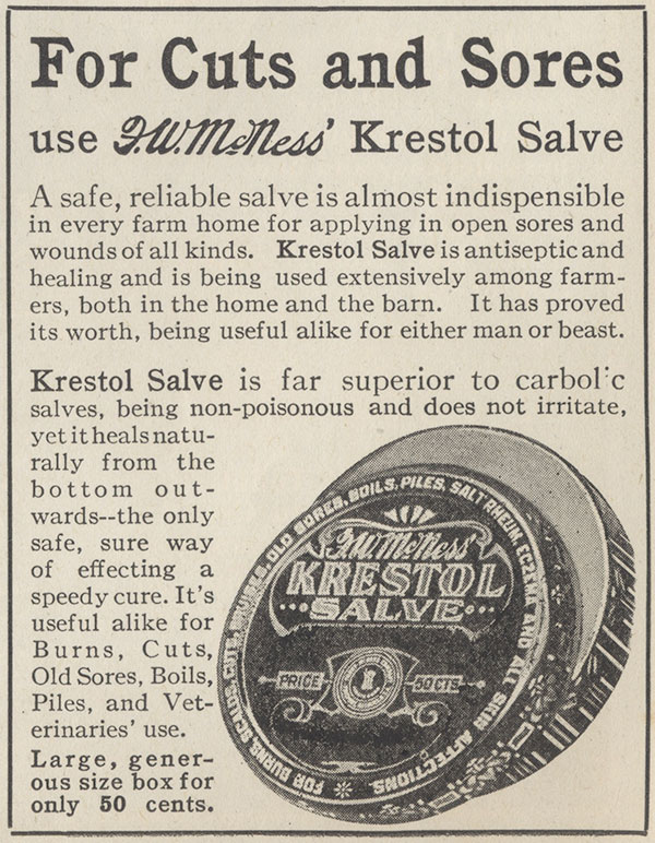
These aren’t original designs of my own, but in this case that’s very much the point. McNess as a brand has been around since 1908, and the designs of these tins have changed very little over the generations. Customers expect McNess tins to look like they do, and the vintage design is part of the brand, so it was determined that the overall design of the tins needed to stay the same. But some changes needed to be made, and they needed to be faithful to the brand.
Firstly, the names were an issue. Originally marketed as “Mentholated Ointment” and “Krestol Salve”, the FDA is a lot stricter about calling things “Ointments” and “Salves” nowadays. The original artwork was hand-lettered, so to maintain the same aesthetic while updating the names, I wasn’t able to leverage an existing font. Instead I created new letters matching the style of the original.
Secondly, the tins themselves had changed. Krestol in particular used to come in a fairly massive 11oz tin, which was excessively large in a lot of cases (it wasn’t unusual for customers to order a new tin to replace one their family had been using for decades). Redesigning it to use the same tin size as the Mentholated tin gave customers a more reasonable option, helped reduce manufacturing cost, and consolidated the product line. (A new large plastic tub was added for customers who genuinely used it it large quantities.)
And on top of all of that, McNess home products are now made by the Sugar River Trading Company under license from the Furst-McNess Company, so a lot of the copy and labeling needed to be changed in the process.
